
A blush and gold home office is more than a pretty Pinterest board — it is a deliberate design strategy that pairs a calming neutral-warm base with metallic warmth to create a workspace that feels both polished and productive. Whether you are converting a spare bedroom, carving out a corner of your living room, or finally upgrading a space that has been “temporary” since 2020, this guide walks you through every decision — from the first paint swatch to the final desk accessory — so you can build a room that actually works as hard as you do.
This is the complete resource: color theory, real paint names, furniture selection at three budget tiers, gold-mixing rules, lighting math, video-call background strategy, and the common mistakes that quietly sabotage home offices. Bookmark it. You will come back.
Why Blush and Gold Work Together
The blush-and-gold pairing succeeds for reasons that go deeper than personal taste. Understanding those reasons helps you make confident decisions in every section that follows.
Color-theory foundation. Blush sits in the warm-neutral zone of the color wheel — a desaturated red-orange that reads as soft pink in lighter values and dusty rose at medium depth. Gold is a warm metallic with strong yellow-orange undertones. Because both hues share a warm base, they create a tonal harmony that feels cohesive without being monotonous. The slight contrast between pink undertones and yellow undertones adds just enough visual interest to keep the palette alive.
Psychological impact in a workspace. Research from environmental psychology consistently shows that muted warm tones lower perceived stress while maintaining alertness — a combination that cool grays and stark whites struggle to achieve. A 2020 study published in the International Journal of Environmental Research and Public Health found that warm interior color schemes were associated with more positive mood ratings and higher self-reported comfort during focused tasks. Blush delivers that warmth without the intensity of saturated pinks or reds, which can become fatiguing over long work sessions.
Gold accents introduce a reflective quality that bounces light around the room and adds perceived richness at minimal cost. In design language, metallics function as “visual punctuation” — they break up matte surfaces, create depth, and guide the eye. A room with zero reflective surfaces feels flat on camera and in person; a room with too many feels chaotic. Gold, used with restraint, sits in the productive middle.
Versatility across styles. This palette flexes across design aesthetics more easily than most themed color schemes. Pair blush and gold with clean-lined acrylic furniture, and you land in modern glam. Add natural wood tones and linen, and you arrive at organic-modern. Introduce marble textures and fluted details, and you are in quiet luxury territory. The base palette stays the same — only the supporting materials shift. That flexibility matters when your taste evolves or your budget changes, because you will not need to start from scratch.
If you are still exploring which direction your overall home office design should take, start with the palette and let the material choices flow from there.
Best Blush Paint Shades (with Practical Selection Tips)
Choosing the wrong blush is the single most common early mistake. “Blush” is not one color — it spans a wide range from barely-there pinks to warm mauves, and undertones vary dramatically across brands. Here is how to navigate the options.
Undertone categories. Blush paint shades generally fall into three undertone families. Peach-blush leans warm with visible orange-yellow underneath — think sunset warmth. True-pink blush is cooler, with a cleaner pink read that pairs beautifully with brass-leaning golds. Mauve-blush skews slightly purple, creating a moodier, more sophisticated backdrop that works in rooms with abundant natural light.
Proven shades worth sampling. The following are specific, commercially available paints with strong track records in home offices. Benjamin Moore First Light (2102-70) is a pale peach-blush that opens up small rooms without reading overtly pink — it was their 2020 Color of the Year and remains a designer staple. Farrow & Ball Setting Plaster (No. 231) is a warm putty-pink with earthy depth that photographs beautifully on video calls. Sherwin-Williams Likeable Sand (SW 6058) is technically a warm neutral, but in rooms with gold accents, it reads as a sophisticated blush — this is the safest pick if you are worried about going “too pink.” For a bolder statement, Benjamin Moore Venetian Portico (AF-185) offers a true dusty rose that anchors a room and makes gold fixtures pop.
The sampling rule you must follow. Never choose a paint color from a screen or a small chip. Order peel-and-stick samples (most major brands sell large swatches for a few dollars) and test them on two walls: one that receives direct daylight and one that is primarily lit by your artificial lighting. Observe the samples at 9 AM, 2 PM, and 8 PM. Blush tones shift dramatically between cool daylight and warm tungsten light. A shade that looks elegant at noon can read like bubblegum under warm LEDs at night.
Try experimenting with our room color palette generator to see how your chosen blush works alongside gold tones, whites, and neutrals before you commit to a gallon.
 7")
Finish matters. For office walls, use eggshell or matte finish. Satin and semi-gloss reflect overhead lighting unevenly and create visible hot spots on video calls. If you want a wipeable surface near the desk, use satin only on that accent wall and keep the remaining walls in eggshell.
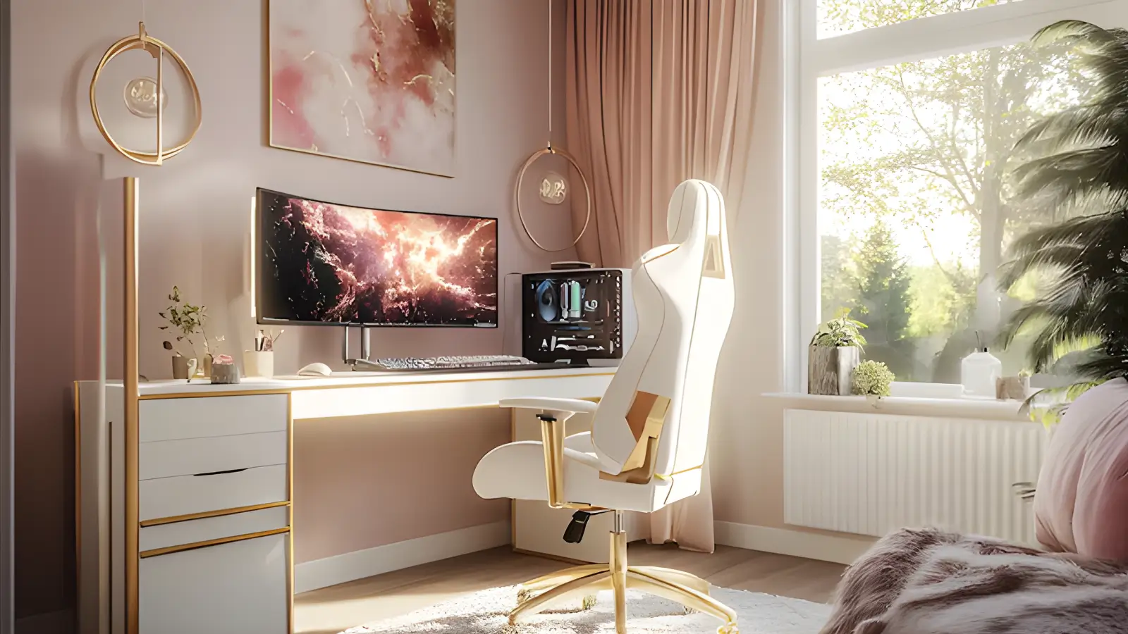
Essential Furniture (Desk, Chair, Storage)
Furniture is where aesthetics meet daily function, and in a home office, you cannot sacrifice either. A beautiful desk that destroys your posture is not a design win. Here is how to choose pieces that look right in a blush and gold palette and actually support productive work.
Desks. The desk is the visual and functional anchor of the room. For a blush and gold scheme, the ideal desk surface is white, light oak, or marble-look laminate — these keep the room feeling bright while providing a neutral stage for gold accessories. Avoid very dark desktops, which create too much visual weight and fight the airiness of the blush walls.
Size matters more than style. Measure your available space, then subtract six inches per side for chair clearance and walkways. A desk depth of at least 24 inches is necessary to position a monitor at a comfortable viewing distance; 30 inches is better if you use a large screen. The OSHA computer workstation guidelines recommend that your monitor sit at arm’s length with the top of the screen at or slightly below eye level — your desk depth directly impacts whether that is achievable.
Budget tiers for a blush-and-gold-compatible desk: under $200, look at laminate-top desks with gold-tone metal legs (brands like VASAGLE and CubiCubi offer this combination). In the $200–$500 range, solid wood desks with brass or gold-finished drawer pulls give you a substantial feel without custom pricing. Above $500, consider a white quartz or marble-top writing desk with a brushed brass frame — this becomes a statement piece that anchors the entire room. Browse more options in our dedicated home office desks collection for curated picks across all three tiers.
Chairs. Your chair is the single highest-impact ergonomic decision. A blush velvet accent chair might look stunning, but if it lacks lumbar support, adjustable height, and a proper seat pan depth, your back will pay the price within weeks.
Prioritize function first: adjustable seat height, adjustable lumbar support, seat depth that allows two to three fingers of clearance behind your knees, and armrests that let your shoulders relax. Then find that function in a finish that complements your palette. White-frame mesh chairs with gold-tone accents exist at multiple price points. Boucle or cream upholstered task chairs with brass bases offer warmth that blends into the blush palette. If you already own a good ergonomic chair in black or gray, do not replace it purely for aesthetics — instead, drape a blush throw over the back or add a blush lumbar pillow to bring it into the scheme. Use our ergonomics score tool to evaluate your current setup before spending money on a new chair, and explore our full range of home office chairs for options that balance comfort with style.
Storage. Clutter is the silent killer of any designed room. Build storage into your plan from the beginning, not as an afterthought. A gold-finished bar cart repurposed as a printer and supply station is one of the most popular solutions in blush-and-gold offices because it adds metallic warmth, provides open storage, and is easy to roll out of frame during video calls. Floating shelves in white or natural wood with gold brackets keep supplies visible and accessible without floor clutter. A small closed cabinet or file pedestal in white provides a home for paperwork and cords you do not want seen. For more storage strategies sized to small workspaces, see our home office storage guide.
 8")
Gold Accents and How to Mix Metals Correctly
Gold accents are the jewelry of a blush and gold home office — and like jewelry, the key is coordination, not exact matching. Understanding the spectrum of gold finishes prevents the most common accessorizing mistakes.
The gold finish spectrum. Polished brass is the warmest and most traditional, with a yellow-rich tone. Brushed brass tones down the shine and adds subtle texture. Satin gold sits between brass and champagne, offering warmth without the full yellow saturation. Champagne gold is the coolest of the gold family, with a soft, almost silvery warmth that works in rooms with cooler blush shades. Gold-dipped or gilded finishes vary widely by manufacturer.
The 70/30 metal rule. You do not need to match every metal in the room to the exact same finish. In fact, an all-metal room feels strangely flat. The professional approach: choose one dominant metal finish (70 percent of your visible metal surfaces) and one secondary metal (30 percent). For a blush and gold office, your dominant metal is whichever gold finish you have selected. Your secondary metal could be matte black (for contrast and grounding), chrome or polished nickel (for a cooler counterpoint), or rose gold (for a tonal blend that stays in the warm family). Keep the secondary metal consistent, too — one black desk lamp and one black picture frame are intentional; one black lamp, one chrome frame, one copper vase, and one oil-rubbed bronze knob are visual noise.
Where to place gold. Think of gold placement in layers. The first layer is hardware: drawer pulls, shelf brackets, and curtain rods. This is the least expensive way to introduce gold and the easiest to swap later. The second layer is lighting: a gold desk lamp, pendant, or sconce. The third layer is accessories: picture frames, a pen cup, a tray, and a small clock. The fourth layer (optional and impactful) is furniture frames: desk legs, chair base, or shelving unit structure. You do not need all four layers — two to three create a cohesive effect without overwhelming the room.
What to avoid. Shiny gold on every surface creates a gaudy effect that undercuts the sophistication of the palette. If your desk legs are gold, pull back on gold accessories on the desktop itself — use marble, acrylic, or white ceramic instead. Also, avoid cheap gold-painted plastic accessories that chip and discolor within months. Brushed metal or plated steel holds up far better and reads as more premium for a small increase in price.
Desk Styling and Organization
A styled desk is not a cluttered desk with prettier objects. True desk styling means every visible item either serves a function or creates visual calm — ideally, both.
The functional core. Start by placing the items you actually use daily: monitor or laptop, keyboard and mouse, a notebook or planner, and one or two pens. Everything else is either storage or decoration, and both categories need to earn their surface space.
The styling formula. After your functional items are placed, add exactly three categories of styled objects: a small plant or botanical element (a four-inch potted succulent, a single stem in a gold bud vase), one textural object (a marble coaster, a linen mousepad, a velvet pencil cup), and one personal item (a framed photo, a meaningful quote print, a small candle that is never lit — fire near electronics and papers is not advisable). This three-part formula creates visual interest without making the desk look like a retail display.
Organizational systems that maintain the look. A gold desk organizer with compartments replaces the random scatter of clips, sticky notes, and charging cables. A small acrylic or white tray corrals items that would otherwise drift across the surface. Cable management clips in gold or clear acrylic keep charging cables from falling behind the desk — a tiny detail that makes an outsized difference in how polished the space reads. Route cables down the back desk leg and along the baseboard using adhesive clips. If your desk is against a wall, a fabric cable sleeve in white or blush hides everything in one clean line.
 9")
Wall Decor and Video-Call-Ready Backgrounds
Your wall decor has a dual job in a modern home office: it needs to make the room feel complete when you are sitting in it, and it needs to read well inside the small rectangle of a webcam frame. These are not the same brief, so plan for both.
Video-call framing. Sit in your desk chair and open your laptop camera or webcam. Note exactly what is visible behind you — this is your “broadcast wall.” Most webcams capture a relatively narrow field of view, so you are typically designing a zone about four to five feet wide and three to four feet tall. Everything outside that zone still matters for the room, but inside that zone, every element is seen by every person you video-call.
What works on camera. Floating shelves styled with a few objects (a plant, a book stack, a small framed print) create depth and personality without overwhelming the frame. A single piece of large-scale art — abstract with blush, gold, and white tones — reads as intentional and professional. Gallery walls work if the frames are cohesive (all gold, or all thin natural wood) and the spacing is even; mismatched frames with uneven spacing look disorganized on camera, even if they feel “eclectic” in person.
What fails on camera? Busy patterns directly behind your head compete with your face for attention. Mirrors create distracting reflections and light glare. Completely blank walls read as cold and unfinished. A single small piece of art hung too high on a large wall looks lost on camera.
Off-camera walls. The walls outside your webcam frame can be bolder or more personal. This is where an oversized inspirational print, a vision board, or a full gallery wall can live freely. Use these walls for pieces that motivate you without worrying about their on-screen performance.
Practical hanging tips. Use a level — always. Even a one-degree tilt is visible on a webcam because the camera frame itself provides a horizontal reference line. Hang the center of your art at 57 to 60 inches from the floor (gallery standard), but then verify the placement through your camera before committing to the nail holes.
Textiles and Soft Furnishings
Textiles bring a blush and gold home office from “decorated” to “designed.” They introduce texture, soften acoustics, and add the layered warmth that hard surfaces alone cannot achieve.
Curtains or window treatments. If your office has a window, your treatment choice affects light, temperature, privacy, and aesthetics simultaneously. Sheer white or cream curtains diffuse harsh daylight while maintaining brightness — they are the best default for most home offices. Layering a blush linen panel behind a sheer gives you flexibility: sheers alone for maximum light, both layers closed for softened warmth or privacy during calls. A gold curtain rod ties the window treatment into the palette with zero effort.
Rugs. A rug under the desk zone defines the workspace visually and protects hard floors from chair casters. Choose a low-pile or flatweave rug in a neutral or blush tone — high-pile shags catch caster wheels and become frustrating within days. A five-by-seven or six-by-nine rug accommodates a standard desk and chair with enough border visible to frame the space. Moroccan-style rugs with blush and cream geometric patterns work well; avoid very busy or high-contrast rugs that create visual noise.
Throw pillows and blankets. A blush or cream throw draped over the back of your desk chair adds softness and color at essentially no cost. If you have a reading nook or accent chair in the office, layer two to three pillows in a mix of blush, cream, and gold — vary the textures (velvet, linen, embroidered) but keep the color story tight. More than three pillows on a single chair moves from styled to cluttered.
Acoustic benefit. Textiles are not purely decorative. Hard-walled rooms with hard floors produce echo and reverb that degrades audio quality on calls. Adding a rug, curtains, and even a single upholstered piece absorbs reflected sound and makes your voice clearer. It is a functional upgrade disguised as a style choice.
Lighting Setup (Natural + Task + Ambient)
Lighting is the most under-planned element in home offices and the one with the greatest impact on both productivity and visual appeal. A blush and gold home office demands a three-layer lighting approach.
Layer one: natural light. Position your desk perpendicular to the window, not facing it, and not with your back to it. Facing a window creates screen glare and can cause eye strain from the brightness contrast. Putting your face in shadow on video calls creates a harsh backlit silhouette. Perpendicular placement gives you even side lighting that flatters your face on camera and reduces screen glare. If your room has only one window and perpendicular placement is not possible, use sheer curtains to diffuse the incoming light and add a ring light or key light for calls.
Layer two: task lighting. Your desk needs direct, focused light for reading, writing, and close-up work. A gold-finish adjustable desk lamp with a color temperature of 4000K to 5000K provides the crisp, slightly cool light that reduces eye strain during long focus sessions. The U.S. Department of Energy’s lighting guidance recommends 50 foot-candles for office tasks — you can measure this with a free smartphone lux meter app to confirm your setup is adequate. Avoid warm-only bulbs (2700K) for task lighting; they create a cozy mood but make small text harder to read.
Layer three: ambient lighting. Ambient light fills the room and sets the overall mood. A ceiling fixture or flush-mount in gold or brass provides general illumination. Supplement with a floor lamp or table lamp in a corner for warmth during evening work sessions. Use bulbs in the 2700K to 3000K range for ambient fixtures — the warmer tone makes blush walls glow and creates a comfortable atmosphere.
Use our lighting calculator to determine the right lumen output for your specific room dimensions. Undersized lighting makes a room feel gloomy, no matter how well it is decorated; oversized lighting washes out wall color and creates glare.
 10")
Dimmer switches. Installing a dimmer on your overhead light (a $15 to $30 DIY project for single-pole circuits) gives you instant control over the room’s mood and energy. Full brightness for focused morning work, half for afternoon creative sessions, low for end-of-day email — one switch, three atmospheres.
Video-call lighting. If you take frequent video calls, consider adding a small ring light or LED panel at desk level, positioned in front of you and slightly above eye height. Even in a well-lit room, a dedicated face light eliminates under-eye shadows and makes your complexion look even and healthy on camera. Choose a light with adjustable color temperature so it can match the room’s ambient tone — a blue-white face light in a warm blush room creates an unflattering color clash.
Small-Space and Budget Solutions
Not every home office gets its own room. Many of the best blush and gold home offices exist in corners, closets, and shared spaces. Constraints are not obstacles — they are design parameters.
Corner offices. A corner desk with a 40-to-48-inch surface fits into tight spaces while providing a usable work area. Mount a single floating shelf above the desk at eye level for styling and storage. Use the vertical space: a tall, narrow gold-finish bookshelf in the adjacent corner stores supplies while reinforcing the palette.
Closet conversions. A standard closet with bifold doors removed becomes an instant office nook. Paint the interior blush, install a shelf at desk height (28 to 30 inches from the floor, per Canadian Centre for Occupational Health and Safety desk height guidance), add a wall-mounted light, and you have a concealed workspace that disappears when not in use. Curtains on a gold rod can replace the removed doors for a finished look.
Shared-room strategy. When your office shares space with a bedroom or living room, visual boundaries matter. A blush-and-gold room divider or open bookshelf creates a zone without blocking light. Keeping the office corner’s rug, lighting, and wall decor distinct from the rest of the room signals “workspace” psychologically, which helps you switch in and out of work mode.
Budget tiers. Here is a realistic breakdown for building a blush and gold home office at three levels.
The starter tier, under $500, focuses on paint (one room runs $80 to $150 for quality paint and supplies), a budget desk with gold legs ($120 to $180), your existing chair with added blush accessories ($20 to $40 for a lumbar pillow and throw), gold adhesive hardware for existing furniture ($15 to $25), and a gold desk lamp ($30 to $60). This tier creates the palette and the essentials.
The mid-range tier, $500 to $1,500, adds a proper ergonomic chair in a neutral tone ($250 to $500), floating shelves with gold brackets ($60 to $120), a rug ($80 to $200), layered curtains with a gold rod ($100 to $200), and styled desk accessories ($50 to $100). This tier creates a complete, camera-ready room.
The premium tier, $1,500 to $3,500, introduces a statement desk with brass or gold frame ($500 to $1,200), designer-quality lighting across all three layers ($200 to $500), professional-grade artwork or custom prints ($150 to $400), upgraded textiles including quality curtains and a premium rug ($200 to $500), and a smart lighting system with dimmers and scene control ($100 to $300). This tier creates a room that could be featured editorially.
Regardless of budget, the highest-impact investments in order are: paint (it covers the most visual area per dollar), the desk (it is the room’s focal point), and lighting (it changes how every other element looks). Allocate your budget to these three first.
Common Mistakes to Avoid
Years of observing home office transformations reveal consistent mistakes that undermine even well-intentioned blush and gold designs. Avoiding these will save you money, time, and frustration.
Going too pink. The most frequent error. When every surface reads pink — pink walls, pink chair, pink rug, pink accessories — the room becomes saccharine and one-dimensional. Blush should be the backdrop, not the totality. Balance it with white, cream, warm gray, natural wood, and clear or acrylic surfaces. Gold accents alone are not enough counterweight to an all-pink room.
Choosing decorative over functional furniture. A gold vanity-style desk with no storage and a 20-inch depth looks beautiful in a photo and is miserable to work at for eight hours. Always verify that your desk meets minimum ergonomic dimensions before considering aesthetics. The same applies to chairs: no amount of visual beauty compensates for absent lumbar support during a full work day.
Ignoring cable management. A carefully styled desk with a tangle of black-and-white cables spilling off the back edge defeats the entire design. Spend $15 to $30 on cable clips, a cable tray that mounts under the desk, and a power strip with a short cord. This is a one-time effort that makes the room look permanently polished.
Mixing too many metal finishes. We covered the 70/30 rule earlier, but it bears repeating here because it is so commonly violated. When every accessory is a slightly different shade of gold — from bright yellow-gold to antique brass to rose gold to copper — the room looks like a clearance bin, not a curated space. Pick your primary gold finish and stay disciplined.
Overlooking acoustics. A hard-floored room with minimal textiles produces an echoey audio quality that makes video calls unpleasant for everyone involved. Even one rug and a set of curtains dramatically improve the sound profile.
Skipping the testing phase. This applies to paint colors, furniture dimensions, and lighting temperatures. Testing takes a few extra days or dollars but prevents expensive returns and repaint jobs. Always sample before committing.
 11")
FAQ
What is the best blush paint color for a home office?
It depends on your room’s natural light and your undertone preference. Benjamin Moore First Light (2102-70) is the safest choice for most spaces — it is a soft peach-blush that reads warm and neutral without becoming overtly pink. For rooms with strong natural light, Farrow & Ball Setting Plaster (No. 231) adds more depth. If you want the blush effect without committing to pink, Sherwin-Williams Likeable Sand (SW 6058) is a warm neutral that takes on a blush quality when surrounded by gold accents. Always test a large swatch in your specific room before buying full gallons.
Can I create a blush and gold home office on a tight budget?
Yes. The most affordable path starts with paint, which transforms the largest visual surface area for under $150. Add gold-tone adhesive drawer pulls to existing white furniture for $15 to $25 total. A budget desk with gold metal legs costs $120 to $180. Use a blush throw pillow and blanket ($20 to $40) to bring your existing chair into the palette. A gold desk lamp runs $30 to $60. The full starter setup lands under $500 and creates a recognizable blush and gold aesthetic.
How do I prevent my blush and gold office from looking too feminine for professional video calls?
Balance is the key. Keep the blush subtle (closer to warm neutral than saturated pink), and ground the room with elements like natural wood, matte black accents, clean-lined furniture, and green plants. A blush wall with a white desk and gold hardware reads as sophisticated and design-forward, not juvenile. On camera, what clients or colleagues see is a well-lit, cohesive space — the overall impression is professionalism and intentionality, regardless of the color family.
What gold finish works best with blush walls?
Brushed brass and satin gold are the most versatile options. Brushed brass has enough warmth to complement blush without being as flashy as polished brass, and its muted sheen reads as modern rather than ornate. Satin gold works particularly well in contemporary or minimalist spaces. Champagne gold is a good choice if your blush leans toward mauve or cool pink, as its lighter tone prevents the palette from feeling too heavy.
How do I make a small blush and gold home office feel bigger?
Choose a lighter blush shade (closer to tinted white than saturated pink) to maximize the sense of openness. Use a mirror on one wall to reflect light and create visual depth. Opt for a desk with slim legs rather than a solid panel base, which allows the eye to travel through the furniture to the wall and floor beyond. Keep the floor visible — a rug is fine, but avoid oversized furniture that fills every available inch. Floating shelves instead of floor-standing bookcases preserve floor space while providing storage.
What type of desk is best for a blush and gold home office?
A white or light-toned desk with gold or brass hardware is the most versatile foundation. Look for a minimum depth of 24 inches (30 is better for monitor setups) and a width of at least 40 inches for comfortable work. Writing desks with one or two drawers give you a clean silhouette with some built-in storage. If you need more workspace, an L-shaped desk with a clean design and gold-tone legs provides significant surface area without breaking the aesthetic.
Can I mix gold with other metals in my blush home office?
Absolutely, and doing so is actually recommended. A single metal finish throughout a room can feel flat and one-dimensional. The professional approach is the 70/30 rule: 70 percent of your visible metal surfaces in your chosen gold finish, and 30 percent in one consistent secondary metal. Matte black is the most popular secondary choice because it adds grounding contrast. Chrome or polished nickel works if you want a cooler counterpoint. The key is keeping the secondary metal consistent rather than introducing three or four different finishes.
How important is lighting in a blush and gold home office?
Lighting is arguably the single most important element after the paint color, because it changes how every other choice in the room looks. Blush walls look entirely different under warm 2700K light versus cool 5000K light. Gold accents need light to reflect, or they appear dull and brownish. A three-layer approach — natural light from the window, focused task light on the desk, and warm ambient light from a floor or ceiling fixture — ensures the room looks polished and functions well at every hour. Poor lighting undermines expensive furniture and beautiful color choices.
Final Recommendations
Building a blush and gold home office is a project with layers, and the best results come from approaching those layers in a deliberate order. Here is the recommended sequence.
Start with your room’s constraints — dimensions, window location, existing furniture you plan to keep, and budget. These facts dictate what is possible and prevent you from designing a fantasy that does not fit your reality. Measure the space and sketch a rough floor plan with furniture placement before purchasing anything.
Next, choose your blush paint shade. This is the largest visual element in the room and will influence every subsequent decision. Sample three options, test them in your actual light conditions, and live with them for 48 hours before deciding.
Third, select your desk and chair. These are the functional spines of the room. Prioritize ergonomic specifications, then find options that fit your palette. Remember that you can always bring a neutral chair into the blush and gold scheme with accessories — you do not need to find a perfect blush-and-gold chair on day one.
Fourth, layer in gold accents using the hardware-first approach: swap drawer pulls, add gold shelf brackets, and install a gold curtain rod. These small changes create a cohesive metallic presence at low cost, and you can always upgrade to gold-framed furniture later if the budget allows.
Fifth, address lighting. Confirm your desk lamp provides adequate task illumination (50 foot-candles on the work surface), add ambient lighting for mood, and test the entire setup through your webcam.
Finally, style and accessorize. This is the last layer — the desk accessories, the throw pillows, the art, the plants. Styling is where personality enters, and it is the easiest and least expensive layer to adjust over time. Do not try to finalize every accessory on launch day; a room that evolves over weeks feels more personal than one assembled in a single shopping cart.
A well-designed blush and gold home office is not about replicating a specific image — it is about building a space that supports your work, reflects your taste, and makes you feel genuinely good about sitting down at 9 AM. Take the framework in this guide and make it yours. For a full overview of all available home office furniture across every category, start there and build outward.
 12")